Table of Contents
- Dashboards democratise data
- Dashboards show instead of tell
- Dashboards offer customised views for different thinkers
- Dashboards are ever-present
- Dashboards are playful and inviting
There’s a lot of talk these days about how to drive deeper engagement between finance and business teams. One way to do so is with financial dashboards.
Visual analytics open the door for a more collaborative environment in which easy-to-interpret data is more readily shared and can be accessed by anyone with permission to view the dashboard. This is an essential benefit, considering the challenges CFOs and their finance teams face now.
Keeping data in silos is one of the biggest financial mistakes organisations can make. And it’s not going to get any better when you consider the sheer amount of data that today’s businesses must manage. “Over the last two years alone 90 percent of the data in the world was generated,” Forbes recently reported.
The simple clarity of reports, graphics, dashboards, and the accompanying analytics can shatter silos and manage increasing data loads to reveal hidden opportunities and insights that likely would have been missed in more traditional analysis and sharing of data.
Here are five ways dashboards can serve as a catalyst to identifying valuable insights that may have been overlooked in the past.
1. Dashboards democratise data
Simply making dashboards accessible to stakeholders throughout the organisation represents a huge win in itself—and a significant step toward breaking down silos. Yet beyond that, increasing the number of people who have access to data presented in digestible formats exponentially increases the chances of those aha moments occurring. The production floor manager will surely have a different perspective than the CFO. When that perspective is informed with accessible data delivered via a dashboard, the stage is set for new efficiencies and improved productivity.
2. Dashboards show instead of tell
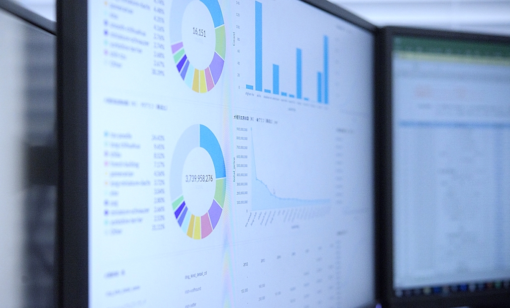
There’s a reason the phrases “go through the numbers” and “eyes glaze over” are often uttered in the same sentence. Traditionally, delivering financial information has largely been a one-way conversation with the finance team presenting mundane reports and data downloads. With the exception of the number crunchers in finance and accounting, many business partners get lost or disinterested when presented with a number or data overload. Dashboards avoid this challenge by elevating the data to the next level and using graphics and visualisations to clearly show data in formats that provide key context and clarity. When data gets presented in highly visual and familiar formats, business users can often quickly see challenges and opportunities that otherwise might have been missed.
3. Dashboards offer customised views for different thinkers
Different people consume information in a wide range of ways. Some may be more comfortable viewing data presented in standard bar, column, gauge, area, and doughnut charts. Yet others benefit from data presented in more engaging or interactive formats. Workday Adaptive Planning dashboards feature data visualisation that includes funnels, dials, waterfalls, bubbles, histograms, radars, and Pareto charts. Users across locations and on any device can view data in the formats that connect with their unique way of learning and thinking.
4. Dashboards are ever-present
Even finance pros and business leaders who are adept at extracting insights from traditional reporting face the challenge of locating reports once they are filed away. And once people find the report, they have the time-consuming process of checking if the data is still accurate. Conversely, dashboards are continuously available via a wide range of devices with data updated in real time, assuring users that they are working with the latest available information. So if conditions change or a new opportunity arises, easy-to-access data visualisation is there to support decision-making and reveal how an opportunity may be quickly leveraged.
5. Dashboards are playful and inviting
Well … playful may be a stretch, but circling back to the Mac analogy, the simple power of dashboards is that they are easy to use and invite users to experiment, explore, and discover. By eliminating the complexity barrier, the odds of uncovering hidden opportunities expand dramatically. Ultimately, dashboards create the opportunity for self-service analysis for everyone. That allows any user to perform drilldown analytics, create period-to-period comparisons, and explore iterative what-if analyses that can effectively identify issues that need immediate attention while also identifying trends that could be leveraged through sales and targeted marketing efforts.
 See Workday Adaptive Planning dashboards in action.
Learn how you can build flexible scorecards to quickly gauge performance, conduct variance analysis, and respond to what’s going on in the business.
Watch DemoHow we can help you succeed
With over 20 years’ experience, 500+ projects and 250+ customers, we have seen every imaginable challenge in delivering successful FP&A projects. ICit can help you to design and plan the solution around your requirements.
We work collaboratively with your finance team to transfer knowledge, share best practice and to deliver a successful project in a matter of weeks. See our Consultancy Services for more details.
This blog was originally published on the Workday Adaptive Planning Blog.


